I have chosen the Caixa Forum of Zaragoza made by the architect Carme Pinós. The construction began in December 2010 and was completed in March 2014, but it was not until June 2014 that it was inaugurated.
It is a space opened to the public intended to promote culture and education, it has an auditorium, exhibition halls, classrooms, bookstores, caffe and terrace.
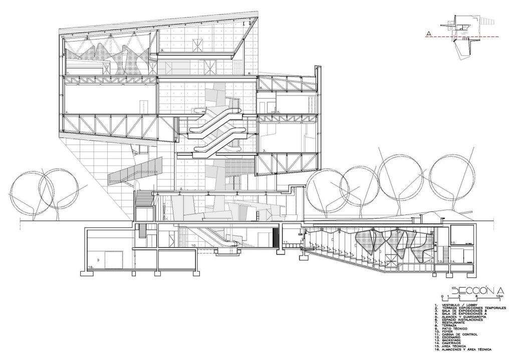
Here we have the sectioned elevation of the building where we can see the basement and the three floors.

To begin with, we can observe how the building establishes curious and sometimes complex geometric shapes that we will now analyze.
We can see how these forms stablish a geometric sequence in space, what we can call rythm. On the other hand, the axes express both symmetry and asymmetry depending on which part of the building we observe. The symmetry is more frequent in the interiors but in the exteriors, we observe certain asymmetry.
The building creates a subtle hierarchy by giving importance to the volume created by the cubes of the facade and downplaying secondary places such as stairs, entrances or windows.
We can see two clear modules created by the aforementioned cubes that divide the building into different floors and rooms.

The design in some parts expresses movement as the main cubes of the façade have slight inclinations that create a visual effect of seeming to move. In addition, in the interior we can also see this in, for example, some pillars that seem to rotate on themselves. In spite of having different shapes and inclinations, the whole building is cohesive so that the design is unitary.
The design plays with different features that make the space unique. In addition to the aforementioned proportions and geometric shapes used, light, color and contrast are employed.
The colors used are simple and discreet such as space gray, white or brown wood. However, in certain interior designs red stands out to give strength and create contrast.
On the other hand, the lights and shadows are experimented with, since at nightfall they are illuminated on the main facade, which simulates large blue butterflies.
Finally we can comment on the textures which are created thanks to the use of different materials such as steel.

